ramonn90
Light and Color Tips! How Ghibli Inspired My Work (Japan Trip)
Published: October 22nd 2024, 12:22:18 pm
Hey everyone, I'm currently in Tokyo and I've been lucky to find great books about Miyazaki's and Ghibli's works. This reminded me how much I’ve been inspired by their films over the years and how their influence has depicted my recent work. So today, I want to talk briefly about what I like about some of their light and color choices in films, how these combinations can be found in my pieces, and light/color choices you can also use to convey similar beautiful compositions.

.
Totoro's Nights and Purples
It's true that Totoro has plenty of daylight green in its forests and countryside, but what captivated me the most was how they depicted the nights with moonlight, using a combination of purples. Having always lived in cities, I sometimes forget how bright the night actually is when there's no electric light around.

In my piece Guardian, the set illumination matches the bright night dark of a forest, where the moonlight reflects slightly on the samurai while fully brightening the little princess. Purple tones can be found in the little princess' shadow and the top of the samurai's illuminated skin.

My tip to achieve this particular mood through light and color is to use purple as light over very dark tones. I don’t use saturated tones when the values are too dark, so for this example, in which the samurai's skin tone is very dark, I went for a grey, slightly blue color for the light. However, as in Miyazaki's sketches, I suggest you go for a more bright, saturated purple than the one I used. On the other hand, when the base tones are bright, like the princess' dress, I make the shadow purple. You can clearly see this combination in Totoro’s shadows and light colors in the small thumbnail at the top. Try this and let me know how it went!
.
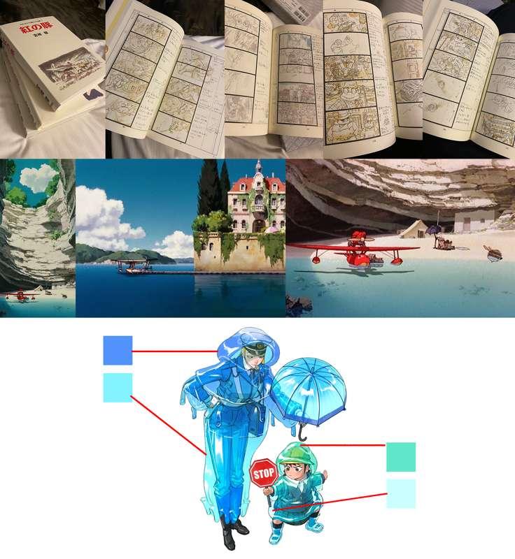
Porco Rosso Days and Blues
This is my favorite film from Ghibli. It portrays the beauty of what I think is the sea landscape in daylight, so it's worth talking about how blues can create this fresh, vibrant vibe.

Some people mentioned that my piece about the jellyfish was inspired by Ponyo, but I think for this example it fits better.

When creating this sort of light and color composition, consider gradients from dark blue to bright turquoise, almost green, like the ones you will see in the police and child coats. These gradients aren’t only found in water, but are also characteristic of skies, where the bright side is at the bottom and the dark at the top.
.
Spirited Away Warm Indoors
Many settings in Spirited Away take place inside the bathhouse. Although it seems to be at night, there’s a prevalence of warm tones that match the mood of the place. With combinations of red, orange, brown, and even purple, this is mostly due to the yellow illumination that also creates a sense of antiquated atmosphere.

I think my piece that captures this particular vibe, not only through light and color but also in the costume theme, is Mannequin.

For this kind of mood, I suggest combinations of yellow lights from the top or sides, since it’s an indoor environment. In darker tones, the light is a mix of the base color with tints of yellow, like in the seamstress' dress. For bright base tones, use brown, red, and orange shadows, similar to those on the seamstress' skin. Lastly, a very slight warm light reflection coming from the floor will do the trick, suggesting a red carpet floor. Although fabric doesn’t reflect strong light like in my piece, perhaps a solid ceramic floor does.
.
Princess Mononoke’s Dark Green
In this film, you can feel the cold and dark yet fresh atmosphere of a deep, dense forest, with very tall trees and moss all around the rocks. Some particular settings have limited daylight illumination, especially the magical ones, like the pond where the protagonist meets the forest spirit. This is mostly due to the density of vegetation, but you can still appreciate variations of green, mixed with blue and brown tones.

Following the magical theme of the Ghibli film, my piece Puppet suggests this idea of a puppet child wanting to become a real boy, one limb at a time.

The tone of the illustration is set to be dark, with the light coming from below, similar to a dark forest. This allows for tints of green in the woman’s black dress and the puppet’s costume. I’ve used green in other pieces as well, but they don’t capture such a mysterious aura like this one. To match that magical vibe, focus on light coming from below and leave the top in a darker tone. I don’t know why, but this always works, I think it’s because it feels mystical.
.
I feel like I’m missing so much out of all the Ghibli films there are plenty of color combinations through light but I’ve mentioned my favorite moments where I think some of my pieces capture the mood through light and color selection. I hope this analysis and insight helps you convey such a beautiful mood.
This is my last week in Japan, and I can’t wait to come back and make some new art. Thank you for sticking around.