ramonn90
Painting Tutorial - Understanding Shirt Study (Art Tips)
Published: September 17th 2024, 3:46:47 pm
Hey everyone,
In today's tutorial, I wanted to take a small break from drawing anatomy and delve a bit more into rendering cloth. I've shared tips on this in the past, but today, I'll walk you through a step-by-step rendering of a very complex shirt reference, explaining my approach using brushes. This will be especially useful if you're tackling challenges like this and don't know where to start. Let's dive in.

I recommend choosing a reference like mine: black and white, with plenty of visible folds caused by light, a clear contrast, but not burned by extremes. By that, I mean avoiding references with too many fully white or black spots. Instead, go for one with a good amount of grey zones to work with. For this tutorial, you can even use the same reference I did. Here
Step One: Start by drawing the contour silhouette of the shirt. Focus on the large shapes, don’t worry about the small details. We will define the lights and shadows through painting, not drawing. Choose a grey tone as the local color, which is the base color where you'll paint shadows and highlights.
Step Two: Create a new layer over your drawing and sketch curves to define the silhouette of the shadows you see in the reference. These curves will serve as guidelines for where your brush will paint the shadows, so don’t merge them with your drawing yet, you might need to turn this layer off after you're done.
Don’t get too caught up in small folds. A helpful rule is to zoom out on the reference until it becomes a thumbnail. From that view, try to identify the general placement of the folds and curves on your drawing. Where to place them? A good tip is to draw them where the light transitions to shadow along the folds.
Step Three: Using a brush with a sharp edge, like "Limberto" from my brush set, paint the shadows on a new layer above the base (local color) layer. Choose a tone slightly darker than your local grey. Make sure this layer is in "multiply" blending mode. The shadows may look rough at this point, but we’ll refine them later. For now, focus on placing shadows just beneath the curves from your guideline drawing since the light source comes from above.
Step Four: On the same layer where you painted the shadows, switch to a different brush called "clean," which has softer edges. This will help you add those smaller folds I told you to ignore earlier. You can also use the eraser tool with the same brush to gently erase parts of the shadows where the previous brush was too rigid. Think of this step as your first pass at refining the shapes.
Step Five: This step is the second refinement pass. Use the "clean" brush again, along with another brush called "soft shapes." The goal here is to soften the edges of your folds and shadows while also erasing parts of them where needed. The combination of clean and soft strokes will give your painting a more three dimensional look. This step can be tricky, as it involves deciding which edges to soften, but I recommend focusing on the larger shapes at first since they draw the most attention.
Step Six: Once your render looks solid, create a new layer above the shadows. Select the shadow silhouette so you can paint inside it on this new layer. Using the soft brush, paint along the boundary between light and shadow. Set this layer to "color burn" blending mode. This will darken the fine line where light meets shadow, creating the illusion of reflected light in the folds of the cloth. It’s a nice finishing touch.
Step Seven: For the final step, create another new layer on top and add a gradient with a lighter tone of grey, going from top to bottom. This gradient should not affect the shadows, so make sure to erase where necessary by selecting the shadow layer edge and erasing from the new light layer using the "clean" brush. Always leave a gap between the gradient light and the shadow edge these two areas shouldn’t touch. The grey in the local color will act as a buffer, creating a smooth transition between bright and dark areas.
Try this quick yet useful tutorial with the reference I shared, or use one you prefer, and post your results in our Discord group! I’d love to see your take on it.
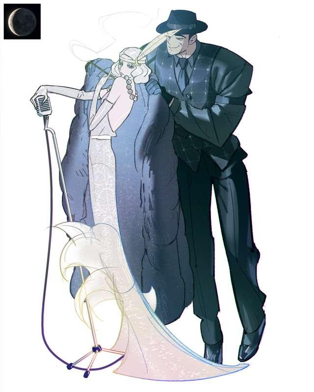
This Friday, I'll be sharing the process behind my new illustration called 'Night.' Be sure to upgrade so you can access the sped-up process video with my commentary on the execution, the full-length process video, and the PSD file for a more detailed look at my technique and approach during this piece. Lots of fun!.
Thank you for your support!