nebula3
New Perspectives
Published: January 24th 2024, 8:10:28 am
Hi everyone!
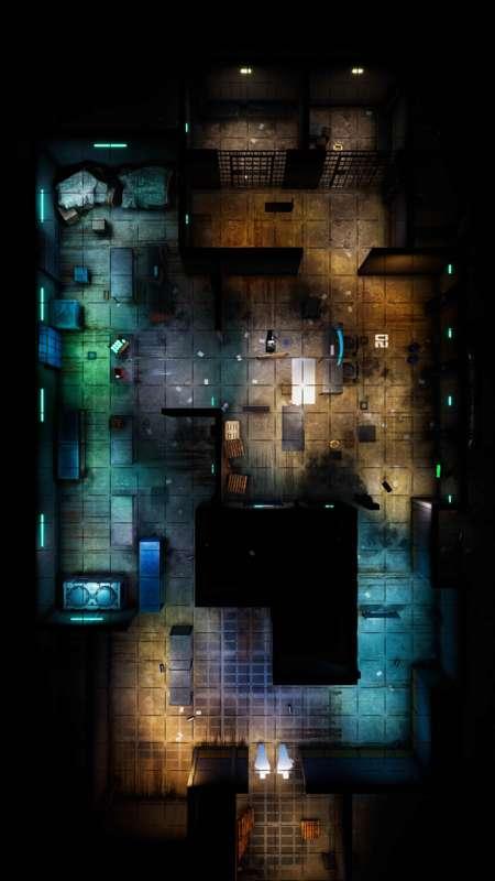
Over the last couple of months I have received some feedback to the use of perspective on my maps. A few people mentioned that the maps are not that useful to them because of the perspective, as it interferes with the readability and usability of the maps. Especially when it comes to aligning a grid, details and especially things like walls can "get in the way" quite easily.
While I have always done my best to align everything flush with a grid, I totally understand the comments, as from the start of this page I knew that having perspective slightly sacrifices readability in favor of more details and atheistic. However, as I'm always looking to improve my maps so I think I can change it slightly.
I have played around with the camera settings and perspectives, and have come to the above result, I have doubled the distance of the camera while halving the Field of View slider.
For the grids to align, I have adjusted the position of all walls and everything visible between the two different takes.
In the post are attached the two comparison pictures, at first glance they are not that different, but if you flip between the two it will become a bit more apparent. The goal is to have the playing field more clear, and show it better to players where they can walk, where the walls are, and where objects are that they mostly have to walk around rather than over. Please don't compare the visuals when looking at the two images, as they are made at different stages of the map.
I plan on creating my next few maps with this halved perspective, please let me know your feedback and comments regarding this change, and whether you agree this is an improvement on my maps or not (perhaps it takes a few more maps to really see the difference).
Thank you all for your feedback and support!!
Paul