mary-masked
Style vs Realism
Published: August 26th 2020, 4:46:23 pm

I'm still plugging away at this Heathers poster and still very worried that my concept has outrun my skills. 
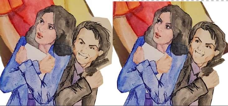
Johnny pointed out that JD and Veronica kind of look like they're on the poster for a Don Bluth adaptation of Heathers. He's not wrong. Much of my childhood drawing was spent with "How to draw Disney" books and I definitely skew cartoony when not working directly from a photo (sometimes even then.)
He pointed out that it's not necessarily a bad thing. A lot of people would probably like a cartoony Heathers poster. And maybe I should be turning into my drawing quirks?
A lot of the illustration classes I've been watching lately have been talking about style. Having a signature style is how you set yourself apart. It's how people know that they want to hire *you.* I thought I'd finally landed on a style with the watercolor and pen thing that I've been doing.

But the realism breaks down when I'm not working directly from a photo, so maybe I should push more into the cartoony style of my more habitual drawing style.

But does that style work with the watercolor look I've been working on? Does it work with the spooky stuff I like to draw? Will anyone buy it or hire me to do it? Do I need to make a whole new portfolio?

Anyway. After spending the day working on the Heathers poster and hating it, I tried drawing some Don Bluth Heathers. And they came out pretty well! Not the angle I need for this composition but...I'm only human. And the likeness on these is better than the "realistic" faces I have right now.

I also used the magic of photoshop to make my JD and Veronica closer to realistic.

(realism on the left, magic on the right)
Side by side there's not a huge difference right now. But if I decide to go more cartoony I can push it in that direction pretty easily by changing some line weights and making the coloring style more "animated."
But, obviously, I'm kind of torn. Thoughts?