mary-masked
The Joy of Shitty First Drafts
Published: July 24th 2020, 6:57:55 pm

My executive function has been completely MIA this week so I haven't finished anything, not even a little. But my Hellraiser post from last week showed me a few things. The first is that bad photoshop is a good sketching tool for me. It gives me a good sense of composition, what works and what doesn't, and I don't get fixated on the technical aspects of making the drawing/painting good.
The second was that it's ok to share works in progress. Even if they don't look good yet. Or if the project is abandoned for whatever reason. I have to be ok with making rough drafts. Third: ROUGH DRAFTS ARE GOOD. It's too stressful to start every project with the idea that I will perfect and polish this till it's good enough to sell and/or put in my portfolio. It's better to slap together some low res mock ups and make a high-res polished version if you still think it's worth it after a few days. It also makes my rough drafts have MUCH smaller file sizes.
So here's some rough drafts.

This was a first stab at a new logo for a company called Moonshot. They went a different direction, but I really like this. It's MUCH more simple than what I usually do, which is good for a logo and something I need to work on. It's also pretty on trend, another thing I'm not great at.

I learned how to make this thing in Illustrator. It doesn't look good, but it helped me learn a technique that I think I'll definitely use a lot more in the future. I can't say I totally remember how it worked. But I have the video bookmarked and a vague understanding of how it worked in the first place. And I know that I *can* do it, which is the first step to doing it well.
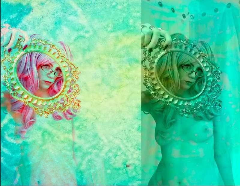
This week I learned about photobashing, which is essentially using a photo as an underpainting and digitally painting over it. This gave new possibilities to flawed photos I'd taken in the past. I'm not sure I have the planning abilities and attention span to put together the photoshoots I have in my brain. But I think I can shoot the separate elements and bring them together. So I put together some old landscape photos and posed photos and will "paint" over them at some point.


I got drunk and did some hellraiser-inspired sketches. I liked this one but wasn't sure if it was a good start to something, or just looked like a scribble in Patrick Bateman's notebook.

I put the two together and added some color. It's definitely not good, but I feel like there's potential for something there.

Then I just went crazy with my Magicians obsession for the rest of the week.

These cards are a really good idea (one that I'm frankly shocked isn't official merch already) but is probably more work than I should put into something that would be SUPER risky to try and sell.

This isn't a terrible idea but doesn't have a super broad appeal.
The safest bet with trying to sell fan art is original drawings that don't look like people who could sue for likeness rights. Most Magicians fan merch is made up logos for Brakebills, original drawings of peaches and plums (it's a whole thing) or just quotes from the show. I'm still not much of a typography or logo artist so I tried the peaches and plums route. But there's already a billion things with that reference so I tried a different one. Largely because I already had a drawing of a disco ball.
The reference was obscure but I thought it looked independently cool. I've definitely bought shirts with logos that I didn't really understand so maybe I'm not the only person?
I also tried drawing other objects associated with The Magicians.
I liked how the clock-tree came out, and Margo's eye. I really like the sketchy quality of the ballpoint pen and am trying to figure out how to make a polished image while still keeping that sketchy quality. I did a little experiment with adding color to the tree and it's not bad.

I've also been wanting an image of all the characters who've been evil versions of themselves. Let's be honest, those are the hottest versions. One way around the likeness issue is this cut paper look, which just suggests the characters enough for fans to recognize them.

Definitely doesn't show that they're evil though. Or even hot.
I tried a sketch of the same composition.
But Eliot's the only one that looks evil. I might work on this drawing more. And just redo Quentin completely.
Finally, I looked back at this old piece, and realized that I wasn't happy with the composition and that it went well with some other pieces I'd done. So I stuck them together and reworked the cropping.

I also laid in some patterns on the fabric since I had no idea how to start painting that. I think it'll still take some more re-working to get a composition and color pallet I really like. And if I really want to make a finished piece, I'll redraw and paint the whole thing. But even if I don't go forward with it, I learned a lot working on this piece and have a much better idea of how I'd go about making a full illustration.