mary-masked
Adventures in Poster Design
Published: July 11th 2020, 6:58:11 pm

I watched a Society of Illustrators roundtable recently and one of the illustrators mentioned the recent trend of alternative movie posters, which sounds right up my alley. So I started working on some of my own to add to my portfolio.
I started a list of movies I'd love to do posters for and the one that really caught me was Braid. Braid is a super weird horror movie with a very femme aesthetic and, TBH, I fucking the poster it has.
It's a movie about three women whose lives are inextricably tangled, hence the title. My first idea was a braid made of the women's three different hair colors. It was a good start but needed more, especially in the way of menace. So I tried making the braid into a noose.

Simplistic designs are very popular and I *do* like that this composition is almost unnervingly spare. But I wasn't totally sure that it read as a braid and not just rope so I kept working.
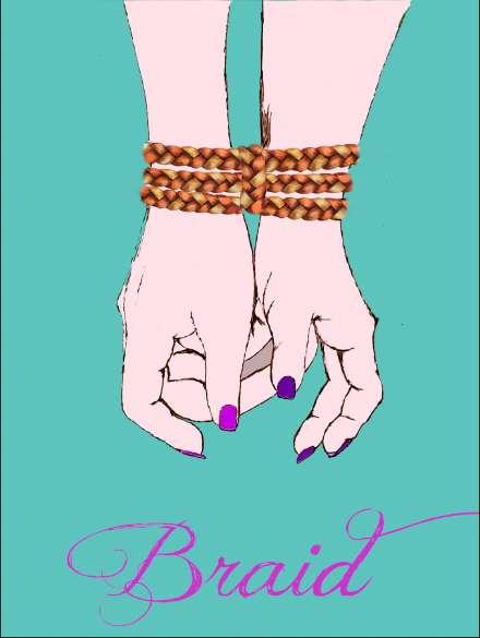
There's a scene where two of the characters are tied up with braids, so that was an obvious second thought but it didn't *quite* work.

One of the most striking images of the movie is the use of an upside down crib as a cage. I thought it would work for the poster because it's both sinister and childish, which is an apt description of the characters in this film. I tried making the crib-cage out of the braid (which involved teaching myself a new skill on illustrator) but that just looked silly. So I switched the line styles and ended up with this, which looks pretty cool.

But it doesn't really tell you much about the film. Something like this would be fine for a well known movie like The Shining. Anyone who's so much as heard of The Shining is familiar with most of its most famous visuals. But most people haven't seen Braid.
Johnny liked the braid bondage image but pointed out that it should be three hands. Which should have been obvious but I was hung up on the logistics of tying three wrists together. Finally, a solution presented itself.

By that time I was tired of pouring energy into things that weren't working, so I just did a quick mock up. This definitely felt closer but I wasn't sure how to have those arms just...end.
I tried something else, but it didn't quite work. And it didn't solve my problem anyway.

Finally it occured to me that the intense girliness of the movie wasn't in the poster either, and it really should be. So I added an aggressively pink and flowery panel, which solved both problems at once.

Since I usually work in watercolors, I might replace the hands with painted versions but I kind of like the starkness they have right now.
I'd love to know what you all think. Also, have you seen Braid? It's on amazon prime and REALLY good if you like trippy, candy colored, horror.