mary-masked
Making a Book Cover
Published: April 21st 2020, 7:48:59 pm

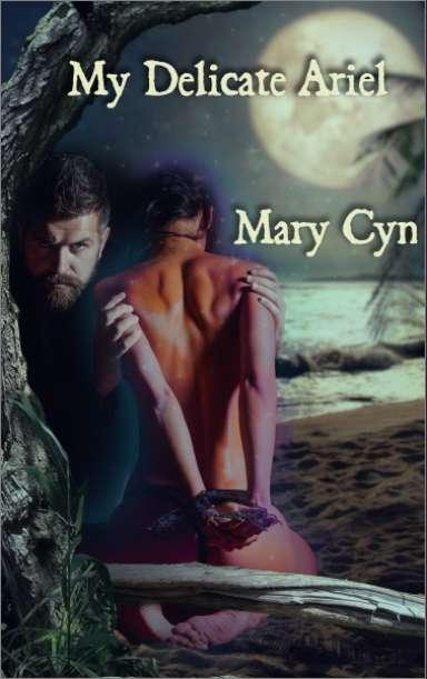
One of the first stories I published was My Delicate Ariel. It's an erotic story based on The Tempest and, much like the source material, it's pretty much about colonialism. Sexy, right?
This publisher was... not easy to work with. Mostly, the editor and I didn't communicate well and it was overwhelmingly frustrating. After months of vague notes that I didn't understand, my boyfriend at the time read it and said "Oh, it needs to be more porny." So I FINALLY knew how to give them a final draft they were happy with.
By then I didn't have any patience left for them and I ok'ed the cover image even though I hated it.

Looking at it now, I realize that it's not terrible. But it's not...great. They had made me fill out a form detailing the characters' looks and the story's themes to give them an idea of what the cover should be. I'd specifically said that Ariel should look like a woman of color and, well, they didn't do that. Like, at all.
I'm pretty sure that I also specified that it was a story using D/s as a metaphor for imperialism and that doesn't really come through either. And there isn't even a hint that this is a sexy story.
So when the rights reverted back to me, I was excited to be able to take it to Stillpoint Eros, a publisher I've always enjoyed working with. Especially because they let me design my own covers.
Then it was off to the stockphotos!
A search for "submissive woman of color" brought up some...interesting results. But I got a few together for a mood board and eventually settled on the photo with the red background (or something close to it.)

Then I put together a few options with different exotic island type backgrounds.

Hooray for blending modes.
I wasn't crazy about the orange color scheme on the right, so that was out pretty quickly. I really liked the colors and texture in the far right but wasn't sure about the composition, so I moved the photo around a bit until I got this

I was definitely getting more interested in the image on the right but I wasn't sure what to do about the guy melting into utter blackness. So I kept the leaves around for a bit. But I don't think I did anything else with them.
Needing something to cover the disappearing dude, I realized that a large plot point of the story is him releasing her from the tree and one of its branches becoming his magic staff.
I forgot to take screenshots for a while, so there's no record of several failed attempts with random stock photos that weren't really what I wanted. Finally I remembered that I had recently *been* to an island with many gnarled trees and taken many photos of said trees.
Eventually I found the right shot from Fire Island and did a quick and dirty cut and paste. I also played with adjustment layers to him look more pale and her more tan.
It was getting there but it looked a little too pedestrian. I wanted it to look more magic, so I brought in some stars.

Cheesy? Probably. But maybe a color filter would fix it?

Ehhhhh?
Editor asked me to tone down the stars (fair) and try to make Ariel look more, you know, magic.

Finally I realized I could make her glow!

Not perfect, but we were getting there.
I did a draft with the actual photos, not just placeholders. It was better but something was off. This is a frustrating thing about photoshop; the difference between correct photoshop and *good* photoshop is so subtle that it can be hard for your conscious mind to pinpoint.
It started to feel like when you're directing a play and watching a scene that's just not as good as you know it can be, but you don't know what notes to give. You just want to shout "Act HARDER!" but you know it won't help because what the fuck does that even mean?
Then I remembered DEPTH OF FIELD! It looked fake because everything was in the same focus as everything else. I watched a few tutorials and got a rough idea of how to fix that (though I'm not sure it's exactly right.)
Then I fiddled about with the lighting effect filter to pull everything together.

Again, it wasn't perfect but I wasn't sure why.
While working on something else it occured to me that, drama queen that I am, whatever effect I put on something needs at least 10% less opacity than I think it needs.

Voila!
I haven't gotten final approval from my editor yet, so it may change a bit. But I think it's looking pretty good. I'll let you all know when the e-book and audiobook are out.
I'll probably have to record the audiobook in my closet during the wee hours of the morning. So we all have that adventure to look forward to.