mary-masked
New Flesh Logo
Published: April 30th 2019, 2:38:01 pm

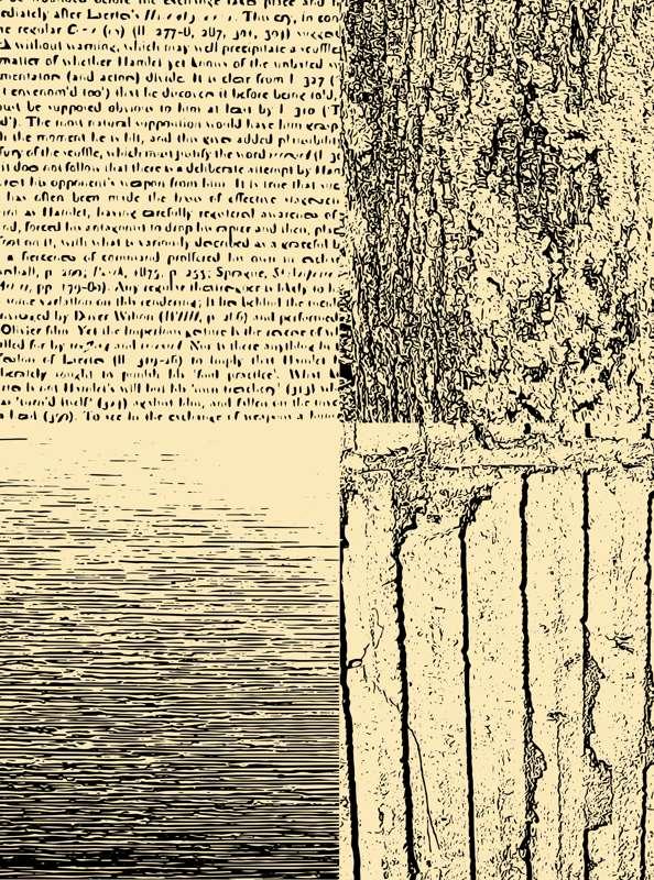
I've gotten really into making texture vectors. I don't know if this is interesting to anyone but me, which is part of why I haven't been posting mouch. I'm still being creative, but I'm not sure it's in a way that's interesting.
I'll make this about my new burlesque show. I promise. It'll just take a little time to get there.
I started making flyers in highschool and I didn't have a computer when I started doing burlesque so I've done a fair amount of xerox art. Teaching myself photoshop and illustrator has been a lot about making my work look more professional and perfect. So you can imagine my confusion when I started seeing classes about how to make your illustrator graphics look like they were made on a xerox machine.
Yup. There are classes on how to add *imperfections* to your computer made art. Because humans are silly. But also because humans are tactile creatures and advertising is the art of standing out *just the right amount.*
So I took a class on how to make these textures and add them to your work. Capture makes it so easy that I've gone a little crazy, taking photos of all sorts of odd things.

And it's a good thing I did, because it was exactly what I needed for my new show's logo.
Since the show is weird, spooky, and attached to a movie theatre for film nerds, I wanted the show to have a cult movie feel. Not a specific cult movie, but like the cult movie section of a video store. That dusty little corner held everything from Videodrome to Jean Cocteau's Beauty and the Beast to Glen or Glenda and is where pretty much all my favorite movies would be housed. You never knew what you'd find in there, but you knew it would be weird. And that's usually what I want people to feel as they are about to experience my art.
Clara and I spent a lot of time talking about movies that would influence the look and name of the show. We settled on New Flesh because it's kinda sexy, kinda creepy, and a movie reference that was just the *right* amount of obscure. And, as I put together the logo, I realized that you couldn't get the right feel across without using an image that looked pretty beat up.

Just looking at it I can feel a well worn VHS box, a crumbling old movie poster, a beat up pulp paperback.
By the time I got the photo from the incomparable Burke Heffner, it all came together perfectly.
