boobacious
[Announcement] Genie's Gift - Alternate Ending
Published: June 9th 2025, 7:51:19 pm
Hi everyone!
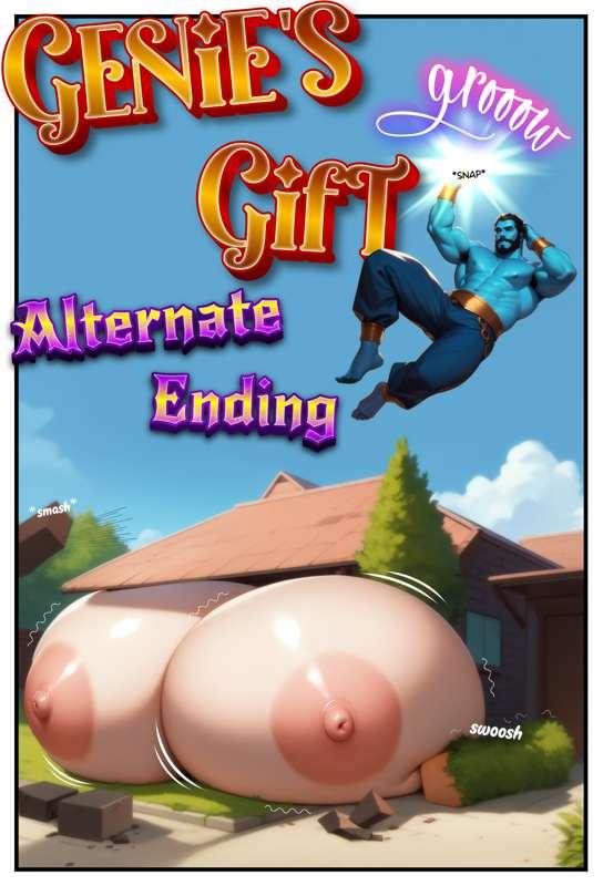
I know, I know. According to my usual schedule, the second part of Curves on Command should have been the next comic - and don't worry, it is coming. But I hit a bit of a writer's block, so I need a little more time for Part 2. In the meantime, I didn't want to leave you hanging, so instead you're getting a comic I've been working on alongside my other projects for quite a while: an alternate ending to Genie's Gift!
At the end of Part 1, Alina blurted out in a hormone-fueled frenzy, “I wish this would never stop!” And then in Part 2, we switched gears into belly expansion, which didn't really honor that wish as stated. While I'm still quite happy with Part 2 and think it made for a great ending to the series, I couldn't stop wondering: What would have happened if the genie had granted Alina's wish exactly as she said it, with no twist into belly expansion?
Well, that's exactly what we'll find out in this alternate ending!
As the cover already hints, we're going to reach sizes we've never seen before! (And yes, I know the house on the cover looks a bit weird - but for consistency's sake, I wanted to use the exact same house I depicted at the beginning of Part 1 of Genie's Gift, and, well... that one had a few quirks haha.)
The comic will likely drop early next week and, as it stands, it's shaping up to be quite a bit longer than usual - currently looking like about 24–25 pages ^^
Busty Beach Babes – Part 3
In the meantime, as always, those of you interested can read my ramblings about Part 3 of Busty Beach Babes:
I'll get straight to the point this time. The highlight and biggest challenge of this comic were, of course, all the scenes where the two girls, Sophia and Alice interact with each other - in other words, any panel that shows both of them together. That was something completely new for me. In previous comics, I did occasionally include scenes with multiple characters, but in most cases it was just the main girl + a generic male character whose only distinguishing feature was usually his hair color.
This time, however, we had two characters with very distinct traits. Not just hair color - Sophia, for example, also has earrings and curly hair, whereas Alice's hair is straighter. In the end, there were way more details to pay attention to in order to keep both characters consistent across scenes. All in all, I'm pretty happy with how those scenes came together and think they look really sexy. A few small details still bother me - like the hair (curly vs. straight) isn't always as clearly defined as I'd like - but overall, the images came out pretty great I think. We'll definitely be seeing more of this in the future. ^^
There were also quite a few changes again in how I illustrated the pages. One example: the hearts. In this comic, instead of the colorful hearts I used in the last few releases, I went with classic black hearts - the kind you typically see in manga. They definitely stand out less and blend in more with the rest of the comic, which you could see as both a plus and a minus. On the one hand, I liked how the red hearts livened up the pages, but on the other hand, they often drew a bit too much attention and could distract from the rest of the page - at least, that's how I see it.
In the end, I don't think there's a definitive "better" option. I'll probably use both approaches in the future, depending on the comic and what feels right. I also have a few totally new ideas that I'd love to try out in the future.
But feel free to let me know which version you like better! Like I said, I'm not really set on either one, so we can totally decide that democratically. ^^
Another point - something I've done here and there in a few past comics but now finally have time to discuss properly: I want to do a bit more with the text. Make it more interesting and engaging.
Part of that means making the dialogue more dynamic. For example, in this comic I emphasized certain keywords in the speech bubbles by making them slightly larger. I think it breathes more life into the dialogue and gives the scenes a bit more emotion, so I definitely want to keep doing that going forward. But again - I'd love to hear what you think.
On top of that, I also want to rethink how I handle sound effects or actions - stuff like grooow or squish. Plain text has worked pretty well for a long time now and does the job, but I have to admit... it's starting to bore me a little haha. So going forward, I definitely want to start using more stylized text in the future (you can already see one example of that at the top of the cover with the grooow).
In Busty Beach Babes, I've already added a few of these stylized bits here and there - like the "Though..." on page 7 or the "Huh?" and Squish on page 20. It's not exactly how I imagined it in my head just yet, but I think it already adds a bit more life to the pages.
Anyway - while we're on the topic of visual details, I'll spare you the usual ramblings about the backgrounds this time - I think everyone gets it by now haha.
The next milestone I want to reach in this regard is to make the backgrounds more interesting and start incorporating some world-building through them (just like many real artists do). There have already been a few hidden background details in recent releases - this time, the only one that comes to mind is the sunscreen on page 8 and... yeah, that's basically it for this comic. Hey, I did say I wanted to do more with it in the future, haha.
Still, the general trend is going to be putting more effort into backgrounds - not just for consistency, but also to include more details and Easter eggs. Even if you don't consciously notice them, I think they help make the artwork feel more natural and real on a subconscious level.
But alright, that's all from me for today. We'll catch up again next week when the alternate ending to Genie's Gift drops. If you want, feel free to revisit Part 1 before then so you're up to speed - the alternate ending will continue directly from there.
Until then, take care!