bazilracoondog
New Apple II art + some extra bonus
Published: December 14th 2024, 12:47:32 am
And just as promised, here's a bunch of new pixel art content. I just CAN'T get enough of Apple II, who knew that in less than two weeks I can make so much content right after discovering the way to work with new retro graphics. 

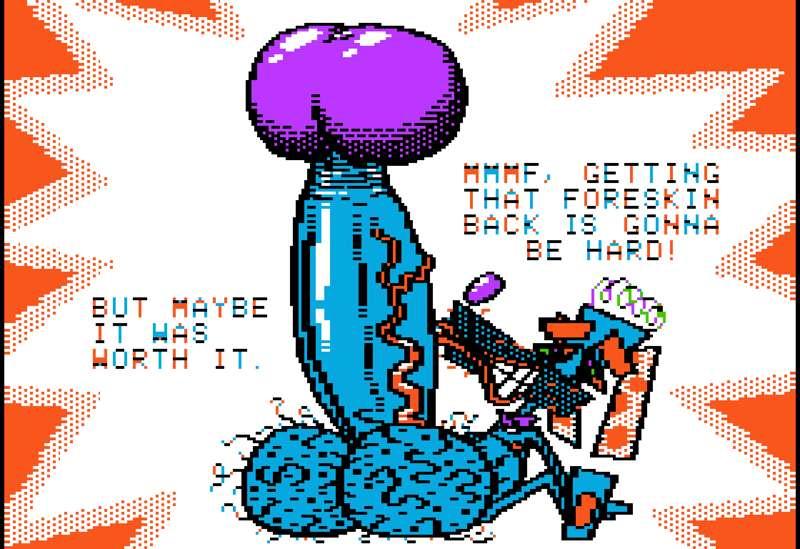
First of all, I did a little 2-frame animation with Zed Vector, I'm really going farther and farther with using him as a play toy for projecting my hyper phimosis obsessions haha, it becomes canon for him. Although it's more like hyper paraphimosis here, you know, the condition where the problem is not being unable to pull the foreskin down to bare the glans but the opposite when the foreskin can't be pulled back to cover it so it kinda strangles it. It must be kinda painful in real life I guess but who cares, nobody prevents us from idealizing just the very physical aspect of it and imagine it being harmless and painless. Really loved the way that hyper throbbing turned out.
 Next art is special because it was made in a double hi-res mode unlike all my other previous Apple II works made in a standard hi-res mode. This mode allows to use the full 16 color palette of Apple II instead of just 6 and the color restrictions are way less crazy and unbearable here, although some color clashing still occurs in places, it feels way more like a free-style pixel art. I'm not very much a fan of this mode to be honest as I prefer more restrictive and primitive 8-bit graphics, not to mention most Apple II games were made in a standard hi-res mode, that's why I wanted to do pixel art exactly in this style and not double hi-res even though other good Apple II drawing tools like Dazzle Draw or Animate suggest it as the only option, I'm always inspired mainly by video games. But DHRS is still somewhat fun to work with, restrictive in its own way, for example the palette is odd and doesn't have a proper red which I showed in this artwork with Zed complaining he doesn't have his nose a proper color. And nobody said there were no games made in this mode, there were!
 And they were pretty cute.
I also recommend to check World Games really quickly, it's interesting how one game uses double hi-res mode for some mini-games and standard hi-res with its recognizable limited palette for some others.
https://youtu.be/KKGsvcb3So4
This mode just wasn't that popular. First, because people say it was a hell to program, keep in mind game graphics were PROGRAMMED back then, not just drawn and put into a convenient game making engine like we do our indie games nowadays. Second, these games seem to have slower performance. Thirdly, the era when Double hi-res was relevant was short, it got sandwiched between the year it was first introduced in 1983 and the year when a 16-bit Apple IIGS was released in 1987 so it were only few years when it would be common to make such games. Surely Apple II games with primitive standard hi-res graphics were still developed up until 1990 but they had their own benefits just like NES, while double hi-res got stuck in a middle, it wasn't really an 8-bit already but yet still not 16-bit as well so it was easier for most developers to just hop to developing 16-bit games for more friendly IIGS instead of messing around with DHRS mode. 
One interesting fact: it's obvious that I honored Apple again by making another Apple logo texture but it's more than just that. I struggled to come up with a simple yet good looking background shape to make Zed stand out and not get lost on a detailed textured background and the idea of using a white double dash is not as random as it can seem. The double dash is stylized II in Apple //e, the only Apple II model where 2 is not stylized as ][, it was a heavily enhanced and the most long living Apple II model released in 1983 and most importantly it's the first model where double hi-res graphics were introduced. And since it's a double hi-res art I decided to commemorate it this way.
Next was my attempt to do Apple II sprites of my characters. It almost became a requirement so far. Whatever system I'm trying to master, there just have to be accurate sprites of my characters done for it. And, well, it's probably the weirdest sprites of my characters I ever did but with Apple II limitations you better trust it's the best I could do, it can't be done better. With all its crazy rules I even feel proud of the results because all my characters still look recognizable as I managed to nail pretty much all the most important features of their. I even did Astro the Something despite I usually stick to my regular beloved 4 men crew of Zed, Mark, Jack and Kit. But honestly the real reason I drew him was conditioned by my next idea. 
Probably my other requirement besides making tiny sprites is making a massive inflation art based on every tiny sprites concept. I already did it with CGA sprites, Commodore sprites, now it's time for Apple II sprites. I went as far as giving Zed the biggest round body this resolution could handle with all 4 boys pumping him at once! And yeah, this is the actual reason I drew Astro sprite, just to make it a symmetric composition.
Expect more animation for this one in future and of course gassy alt with everybody plugging themselves to these hoses instead of just using puny air pumps >:3 The character frames are already done for this idea.

Btw, I used Stickybear sprite from Stickybear Spellgrabber as a sprite size reference. Not the tiniest Apple II sprite ever but still one of the smallest. Although I don't think there were any strict rules for main character size in Apple II as it didn't have hardware sprites anyway and there were some pretty big character graphics like in Karateka, Prince of Persia or Stickybear Basket Bounce but still I feel more confident when I follow some existing sprite's limits and smaller sprites were always more welcomed anyway because smaller characters meant more space for more intricate locations.

And yeah, I think I'll try to make bigger Apple II sprites of the same height as sprites from Stickybear Basket Bounce, just out of curiosity how much more recognizable I can make my characters with two times more space in my disposal.
 The last Apple II art for now is based on a quick Mark Spothound doodle done by my friend SpazzyHyena.
 Here it is. I felt pretty inspired by it and felt the urge to give it a proper Apple II rendition, thank you for inspiration, friend! It could be any other system but since I'm in Apple II mood I chose Apple II. His burping is gonna be animated and the ass shot was made, as you can tell, with one sole purpose, you know. It's gonna be gassy all the way. The tiny full-body picture is yet another attempt to see what can be done with tiny sprite graphics preserved at least in a face department and in the other hand I wanted to give really a lot of space for further... Emissions, you know. So it's more wips wips and wips again.
The rest of the post is just a tiny bonus with me doing very quick sprite experiments.

The first image is my attempt to draw my characters as Atari sprites, both Atari 2600 on top and Atari 8-bit family on bottom. Both allowed only 8 pixel wide character sprites, the difference is Atari 2600 allowed to use as many colors as you want but only one color could be used per horizontal line, all black elements are technically see-through holes here, and Atari 8-bit computers allowed to place colored pixels any way you want but you could use only 4 colors per sprite. I didn't bother making nude version so far but I could try for Atari 8-bit family at least.

Next is Game Boy Color sprites. They're pretty big but still possible to be used in a real GBC game, I based the size on Wario Land Game Boy Wario sprite which is pretty big.
I figured out the trick of GBC sprite colors and color distribution in general thanks to GB Studio engine for making Game Boy games where all this stuff is very intuitive and easy to understand. Game Boy Color didn't have a restrictive color palette, in fact it was giving a choice from 32,768 available colors! So why classic games like Legends of Zelda A Link to the Past looked so primitive, almost NES like? Well, GBC has pretty NES-like limitations regarding what colors could you use. The choice of colors is surely big but you had to select 4 colors for 8 sprite palettes used for background and 3 colors 8 palettes for everything else (one color is given away for transparency), no more. And, since palettes had to be uniform and easy to be used together, it usually had each palette having the same black for outlines so it's already less interchangeable colors for you. 
As a result, it's kinda like that in the end. This is a screenshot from GB Studio.
So, you had to be very wise with what palettes you pick because this is all you will be able to use for your entire game. This way, I already almost exceeded the given limit of palettes by just designing 4 characters if you imagine them being in one game. Well, more like 3 because Jack just uses the palette of Zed's ears. But I think it's a normal practice to base part of the palettes off the most important parts like main characters whom you want to be more accurate to your ideas and then draw enemies and minor NPCs with whatever you got for yourself this way.
It's actually a very ancient concept I drew in the very beginning of my path of a pixel artist, I just updated it a bit today. 
Initially it looked like that. I don't even remember if I posted it here before. It's definitely not on my Furaffinity or Twitter.

And the last image is just an attempt to make a SNES Zed sprite compared to Super Mario sprite. Uses two 16x16 sprite blocks, classic size, and 15 colors which is the very limit of colors SNES and Sega Genesis sprites could use. I think it looks cute, can animate it, add more characters and maybe make them nude someday.