bazilracoondog
NEC PC-88, Apple ][ pixel art and Arcade Tapper screenshot edit
Published: December 1st 2024, 2:06:16 am
Since I totally lost my self-control and broke the record of messing up my sleep schedule by going to sleep at 8am yesterday, sadly I failed to finish my current commission before December 1 despite it's already 60% done, so I guess I need to post at least this stuff to give you a showcase of what was done in these last days of the month.
November keeps being a month of a total pixel art binge and a month of great discoveries on this topic which however make me spend way too much time on web surfing, reading, frying my brain trying to figure out all this shit and most importantly messing up my sleep schedule terribly since I always go overly obsessive with such things. Hopefully one day I'll finally quit spending hours on learning, studying and writing insanely long nerdy articles and start spending more time on actually just using my knowledge in horny art as I was always doing so nobody will have to say "I wish you was just drawing round sexy men instead of wasting time on this.", it feels like this moment is getting closer, thankfully.
NERD TALK STARTS HERE
First of all, let's go directly to the main subject of this post, the art you see. It's done according to graphical limitations of a Japanese computer NEC PC-8800 known informally as just PC-88.
I heard a lot about old Japanese computers, had some screenshots from their games saved on my PC long time ago and I was finding their quirky graphics kinda curious but never actually managed to go too deep into this topic until recently when one friend of mine mentioned Japanese computers in another conversation about retro tech. This time, for some reason, this particular conversation lit some spark in me and made me fall deep down the rabbit hole of Japanese computers.
Now, what's so special about Japanese computers and particularly PC-88? Well, pretty much a lot! There were three main lines of computers, NEC computers like PC-88 and PC-98, Sharp computers like Sharp Х1 and Sharp-MZ and Fujitsu computers like FM-7, FM-X and FM Towns. Also a more well known MSX but it was a more standalone system with very different graphics. NEC, Sharp and FM computers had a lot in common and sometimes their graphics were hard to distinguish one from another depending on which models you compare.
PC-88 was released in 1981 becoming a pioneer of such graphics with Sharp X1 and FM-7 being released one year later, this is why I focused mainly on studying only PC-88 for now.
First and most important difference is that PC-88 had a whooping resolution of 640x400 pixels compared to maximum 320x200 that was common among nearly all American and European computers, there were examples of smaller resolution but not bigger, damn!
But since it worked on the same Zilog Z80 CPU used in many other 8-bit computers like ZX Spectrum you can't expect it to be some technological miracle that could make it an ultimately best computer in the world. Big resolution was a benefit that came with a BIG price.  Along with Sharp and FM computers, it used the most limited color palette imaginable, 3-bit palette of 8 primal colors that was used mainly by Japanese and some British computers like already mentioned ZX Spectrum.
But even silly cheap ZX Spectrum had darker counterparts of every color so it was a 15 color palette, Japanese said "Fuck that!" and sacrificed everything for a higher resolution.
Yeah, there were IBM computers with 4 color CGA palettes but still it had 16 colors in its storage and allowed you to use them, even though the usage was extremely limited.
However, it wasn't the only sacrifice Japan made for a 640x400 screen. It's technically 640x200 but the pixels are stretched two times VERTICALLY. Yes.
If you look at any American or European computers like Atari 400/800/XL/XE, Commodore 64, Apple II or Amstrad CPC you see that they have either normal square pixels or the ones that are stretched two-times horizontally depending on the graphic mode, the stretched one was just way more common for games, but no computer had pixels stretched vertically, it's mainly a Japanese standout feature, early Sharp and Fujitsu computers had it for many years too.
But this sacrifice was totally worth it and we can't say Japan chose a wrong path. They knew how to get around the 8 color limitation and managed to get really impressive graphics with it, hence why working with it felt like a breath of fresh air for me after dealing with way more complicated limitations of Commodore 64 or ZX Spectrum.
You may look at my works at first and think they have way more than just 8 colors but no, it's an 8 color palette but color pixels are placed in such dither patterns that create an illusion of having way more colors with a trick of optical mixing.  Like the way you can see it here. Big resolution with pixels looking overall tinier make this effect even more convincing, especially if you apply a slight blur to it. After all, don't forget that screens weren't displaying pixels as sharp as nowadays, they always had a slight blur, CRT lines and so on.
This method opens great possibilities and Japanese computers relied on dithering way more than any others due to this.
However, there still were some other limitations. I don't know how exactly it worked but I noticed that early PC-88 and Sharp X1 games made before 1985 could use only simple 2-color dithering patterns and never put more than 2 colors close together in a pattern. I looked through the history of PC-88 quickly and saw that it had a largely revised new model released in 1985 which was the first model NEC even tried to advertise to USA and I noticed that only after this year PC-88 games started to look way cooler with way more complex dithering patterns, so maybe it was some technical limitation of the early model.
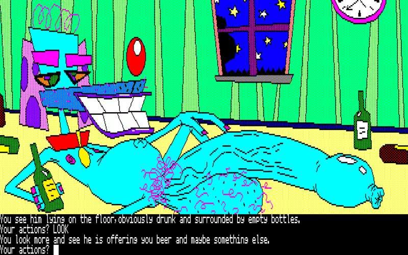
 For example, this is how some early PC-88 text adventure games looked like.
Example games are Princess Tomato in the Salad Kingdom, Dezeni Land, Dezeni World and Hi-res Adventure #4. As you can see, they look super wacky and resemble infantile drawings done in MS Paint but there's some certain charm in them that fits my OCs vibe pretty well and I think it's pretty obvious that I based my own pixel art on the style of these games.
So, what did the games start to look like after 1985? Well, they turned pretty awesome. It's hard to believe but they still used the same primitive 8 color palette but game artists managed to pull an insane amount of colors from it with very complex dithering patterns.
 Just look at these few examples. It's still the same PC-88, same resolution, same colors but it looks really superb, the difference is night and day.
 And, again, the blur does this optical illusion miracle work even better.
This is something I wanted to implement myself and make my own complex PC-88 art but for this I needed to do a lot of preparation with studying and researching this color mixing method. So I decided to make proper dithering pattern map for both early and late 80s PC-88 graphics to simplify the working process for myself.
I started with early 80s style first, since it seems to allow only two color patterns of only two types it was very easy to calculate all possible combinations.
 First it was like this, my first pixel artworks were done with this map, better than nothing but still not very convenient to use.
I realized that half of these combinations repeat themselves and removed all duplicates so a more clean map started to look like a staircase. Better but it was still an unorganized mess. After pondering it for a while I realized that all those combinations can be organized in 4 different ways like this. There's a classic rainbow color spectrum I managed to tie in a ring shape, classic gradient from bright color to black/white and the remaining color combinations formed groups with Red-Green-Blue/Cyan-Yellow-Magenta gradients and a long stripe of gradients going through three points of "incompatible" color couples which form gray color when put together, i.e. red-cyan, blue-yellow and green-magenta.
 Speaking of which, this freaky piano from Dezeni Land is a good example. At first look it seems completely gray, right? A bit grainy but all it makes you think is that it probably uses black-white pixels to make an illusion of it being gray.
 But hell no! After closer examination I was so much surprised to see that this piano uses BOTH black-white, green-magenta and blue-yellow patterns! I have no idea why, it's all just the same gray if not looking close enough.
The colors below each pattern gradient are examples of what color each pattern was supposed to represent. It's very accurate because to get these colors I simply blurred the image slightly and copied the resulting colors.
 See, the miracle of dithering in action.
Then I went even further and started making such maps for more advanced PC-88 graphics. It was a more complex and time consuming task because with more than 2 colors and more pixel placement variations there were way more different kinds of combinations.
I started with simply saving different screenshots of PC-88 games and looking through them in search for different patterns which I copied to a big sheet which later became my new map. I wanted it to be authentic with only those patterns which were used in actual games back then, not to mention, it's not as easy as it can seem, you can't just put any colors in any order to make a new pattern, well, you can but it can easily turn out to be a bad pattern that won't make a proper illusion of color mixing. It's easy to test by blurring the image. If it doesn't make a solid color with a slight 2 pixel blur and instead still looks like some uneven pattern then it's a bad dithering. Original old patterns also had a varied quality and some of them were very questionable, I copied some of those just for authenticity but still 85% of them are good so it's easier to just copy what was already done because it's a rocket science of color theory and it's better to not try to do your own patterns.
Especially since existing ones already give such a range of nuance tones!
 Just look at it, these are all different kinds of dithering patterns I managed to gather from PC-88 games, again, the squares below each pattern show the theoretical color it represents, taken from a slightly blurred version of the picture. The image might not display well on whatever device you're using, all the dithering maps are gathered in archive below for those who're curious to use it.
The third and last part of my research involved working with a particular type of dithering pattern.
As I said, new model of PC-88 allowed to not only use more colors in a pattern but also use different pattern algorithms. There is not really many of them but I still managed to highlight 4 different kinds.
 First is what I called a "cross pattern" because pixels often look like forming crosses in them. It's the most common dithering pattern as it works the best of all, nearly 80% of dithering patterns are like that.
Next is "blocky pattern" because vertically stretched pixels form checkerboard pattern of square boxes. It's the most rarely used pattern because color mixing illusion doesn't work very well with it but still I saw it in several games and it kinda works.
Third is "line pattern" because it looks like you have a certain color pattern interrupted by solid vertical lines. It's the second most popular pattern after cross type one and I can see why.
 The best example is this tile screen for Advanced Fantasian the large part of which consists of different line patterns. It creates a very convincing illusion of having many different nuance tones, especially if you use blurring.
 Hard to believe it's still just a bunch of simple black, white, cyan, yellow, purple and green pixels!
The last pattern is "diagonal pattern" that uses diagonal lines and honestly I saw it only once where it was used for creating a skin tone and it sorta works even though it's kinda odd but still it's a unique way of placing pixels so I divided it into a separate category. Maybe it was used in other games that I haven't seen.
And after I gathered pretty much all possible cross patterns I could find I think it's easy to tell what was the last subject of my research. It was the vertical line pattern and man did I dig that stuff deep. As I said, I failed to make my own cross-type patterns and relied mainly on what I gathered from games but with line-type it was easier to understand how it works in theory and create my own patterns based on this algorithm. Judging by what I saw on the title of Advanced Fantasian, it's simply a checkerboard pattern combinations similar to "blocky" patterns but interrupted with vertical lines of one color.
 So, what I did is I picked every possible two-color combination arranged as a checkerboard (my first simple dithering map was very helpful with it) and put line patterns in 8 different colors on top of them, completing a full chard of all possible three color combinations in line dithering patterns this way.
 The resulting dithering map turned out like this. The base patterns are set a bit aside for better understanding, named and I also having a "||||| color" writing added to show that the row of squares on top of each type of map represent the color of interruption lines.
What it can be used for? Well, it can greatly simplify the process of making complex PC-88 pixel art or converting the image into PC-88 graphics. I did a quick test and was pretty much impressed by results.
 Here's my old Zed Vector pixel art made with 640x480 resolution that is pretty close to PC-88 with just a little vertical resolution excess.
 First I did a quick conversion to Japanese pixel aspect ratio by compressing it to half its vertical size and then decompressing it back. You see what happens, by compressing it to 240 pixels tall I simply remove half of the image's horizontal lines and then I scale it back to 480 getting the same image I had initially but with 240 pixel lines stretched to 480, simply how Japanese computer stretch worked. It's not the best technique for precise graphics because by losing half of the lines I also lose some one pixel tall details such as outlines and need to correct a lot of stuff afterwards so it's pretty flawed but fine for quick tests like this.
The idea was to take every each color used on this pixel art and replace it with the closest corresponding line dithering pattern, like this.
And the result was quite astonishing! Just look, with a little blur being added it looks nearly the same and it didn't took me much time at all to do it. Some stuff surely becomes messy and less distinguishable but only because I didn't put much thought and effort into it. Normally I'd fix the outlines, made them bolder to highlight every detail better and also used different dithering patterns instead of only line type ones but it still works great as a quick showcase.
I'm already working on my own more complex PC-88 pixel art with a full use of all that knowledge I accumulated but it's not even half done, I'll show it someday later.
Also one last yet highly important note on how to work with these graphics in case you're interested.
 It would be silly to imagine me doing this vertically stretched resolution effect manually by drawing everything with a 1:2 grid and watching carefully to not leave a single square pixel anywhere. That would be one hell of an exhausting chore. Multipaint has horizontally stretched pixels automatized for modes that require them, this is how I do my Commodore 64/Amstrad CPC art with just slight tweaks being done manually later in GIMP but Multipaint has no modes with vertically stretched pixels and Japanese retro graphics in general are just not popular enough to have a proper modern tool imitating them like Multipaint does with commonly known American/European computers. This way I started thinking maybe there's way to change pixel aspect ratio in Gimp or Photoshop to work with it and there's actually articles about it but it just didn't work for me. I don't know what I did wrong, maybe I'm just dumb but Gimp only displays it normally, once its saved as png it makes all pixels blurry for some reason. Photoshop does it blurry right away when you work with a canvas. What worked greatly for me is Aseprite I had installed long long time ago but never used. It's considered the best tool for pixel art and it surely has some neat features but, idk, Multipaint and Gimp I was accustomed to felt enough for me and I never really worked with Aseprite. Until these days. By choosing Sprite/Properties... you can chose between 1:1, 2:1 or 1:2 pixel aspect ratio and thank god they have this feature. Unlike Multipaint it simply changes the way your canvas is displayed and the final image file is saved with regular square pixels but stretching it back is a matter of just few clicks. So it still makes it as easy as a free-style drawing but with results being perfectly authentic.
NERD TALK ENDS HERE
Now when I'm finally done with all that extensive and exhausting retro tech lecture I want to get back to my own artworks again and share some more thoughts about it.
To start with, I simply felt very satisfied with what I made, it was simply hard to stop making one picture after another when it all just started with one random image of Zed. And who knows, maybe I'm still not done after those 5. As I already said, working in this style feels so easy and liberating and it looks like the style my characters were just made to be drawn in. I think this is why I chose early style PC-88 games. You know, when I do pixel art I'm thinking about not only making it fit the color limitations but also making it match the vibe of the decade based on how graphics were done back then with all the cultural aspects nailed down. Like, I can't imagine an image of a person using an i-phone or some realistic Mr Wolf or Legoshi art drawn in Commodore 64 graphics, it just feels wrong. Retro graphics feel like they belong to their decade they came from for me which involves not only colors and resolution but also the cultural code. Many modern pixel artists are not trying to hide the modern feel in their works, using pixel art style as just a method of rendering, and I don't want to say it's bad, these are neat works, it's just not the way I prefer to do it myself. And PC-88 is not an exception. It's primarily a Japanese computer so it's better to make more Japanese styled art with its graphics but my characters are not really fitting for this classic big eyed girly shoujo anime style to say the least but games like Dezeni world proved that even Japanese artists were doing wacky and not so straightforwardly anime-like looking games and inspired me to chose this style for my first attempts. I still tried to add some bits of anime expressions here and there with eyes and so on as you can see and it fits in good. I'm also a bit upset that I don't know Japanese, English text simply feels off here and ruins the feel, it's surely important to have English text so everyone can understand the horny descriptions but it would be fun to add Japanese translation, if only I knew somebody who can help me with it. Online translators seem to be extremely unreliable.
 I did this version just for experiment and it looks very good this way but the text is just taken from one screenshot of Princess Tomato in the Salad Kingdom so you can pretty much tell it's completely irrelevant here lmao. I don't even know what kind of letters it is, I guess Katakana?
I highly doubt that I'll make anything playable out of it, so it's just another bunch of faux-game styled pixel art as usual, also I simply don't know how these old parser based text adventure games were working so I'm even not really sure if my wordings on these screenshots are done properly. If I find some other retro nerd who knows more about text adventure games than me then MAYBE I'll consider making something serious out of it, I have way too many game ideas so far none of which became real so I don't want to add even more to this pile.
So, I hope you enjoy this little series despite its kinda crude and simple style, I think dicks still look pretty hot here, I surely went full mode with my foreskin and phimosis kink with this one, it becomes more and more canon for Zed haha. And yeah, there's smegma version of the third pic in attachments because why not? I just couldn't resist myself.
Some more nerd talk
Now about the last artwork in this post. It's very special and I have a big need to tell about one really big peeve of mine that bothered me for a long time and was really wearing on my mind up till today which is actually the reason I went to sleep at 8 in the morning yesterday.
As you can see, I have a very passionate desire to explore and learn more retro systems from the past and use this knowledge for nothing but drawing porn with it, mainly with my OCs. I have a goal to get my hands on as many systems as possible and conquer them by shoving my characters there through pixel art, making Zed and Co some sort of omnipresent digital creatures like if they were some stars from the past, like Donkey Kong and other characters from other arcade classics that were ported and illegally cloned to nearly all possible systems. Also I simply want to become the most versatile retro pixel artist in fandom who can work with nearly every possible kind of graphic style. I'm hoping that this way I can fill this very humble and underrated niche, teach and inspire people and popularize these styles way more in furry fandom because for now I see 70% of pixel artists just picking a random sized big canvas and drawing free-style with as many colors as they desire or doing Game Boy pixel art at the very least but it's boring because Game Boy style is way too popularized already and its limitations are too easy to work with so knowing how to do GB art is not much of a big achievement for me. I understand that many artists are young, they grew with Game Boy Advance and Nintendo DS but c'mon, I'm 28 year old too, it doesn't mean we can't be interested in things that are older than us when there's such a strong relation to modern things we love.
(Also I hope I don't sound too obsessed with my new hobby, I still love drawing and still want to draw sexy stuff with Legoshi, Mr Wolf and whatever other characters that doesn't match with retro graphics aesthetics at all. It's just an obsessive phase)
However, there was one untamed wild stallion that bothered me A LOT. A system I tried to understand so hard and find at least some intuitive software that would help me. And it's not some French Thomas TO8 or Russian BK-00100 nobody really cares about, it's a titan in a world of retro computers that rivaled Commodore 64.
It's Apple II. The first personal computer ever released that actually looked like a computer (there were older examples but they barely resemble what we imagine as a personal computer and didn't even have sound). It was released in 1977, shortly followed by Commodore PET 2001 and Tandy TRS-80 which became known as a "1977 trinity" of first commercially successful and mass available home computers. (some examples of game graphics common for Apple II that including ports of arcade classics like Donkey Kong and Tapper, Spy vs Spy and some other random games including FAT CITY, yeah it's a good name but you just demolish buildings there)
But as you can tell by the early decades of computer history being a tough rocky road towards ever-escalating convenience and intuitiveness, this first trinity wasn't as convenient and intuitive as the 80s computers at all. However, PET is still easy to understand because it has nothing but a monochrome text mode so there's simply nothing to understand, even if it had any graphics it was text based like ASCII art, TRS-80 or at least some of its modes are also easy to comprehend and do a pixel art for it but Apple II... APPLE II IS A TOTAL FUCKING NIGHTMARE. I tried my best trying to wrap my head around how its graphics worked but my stupid artist brain that is just not made for understanding electronics, coding and high-level math just couldn't comprehend all this mess. I tried reading literature, searching through sites, forums, looking for any software, image converters and so on, useless. Everybody who still knows how to work with Apple II are old big-brain nerds, usually programmers and IT specialists who know how to code and so on, I don't understand anything they talk on forums, mostly all modern software for working with Apple II image graphics like image converters and so on are made by them and can't be even fucking LAUNCHED without coding commands. One program really pissed me off with its very teasing video showcase showing how it can be connected to Photoshop and replicate everything you do in Photoshop in a separate window as Apple II graphics in parallel but making it work requires knowledge of C++ and Python which is something I'll never learn. Some image converters were easier to use and more intuitive but I tried 3 of them and they all worked like shit, results didn't look really convincing for me, I needed to make sure that what I'm making is 100% authentic.
You can't even imagine how much it annoyed me. These obsessive thoughts were taking over me about 2 or 3 times this month, just a single occasional thought about it coming to my mind again was enough to think "Agh!! WHY I can't understand it???" and spend several hours till 5 in the morning hopelessly searching for the solution of my trouble. I was pissed off, you can't go deep into retro tech topic and early 8-bit games without talking about Apple II, it's all over the place, many games had Apple II versions no matter how shitty its graphics were and many Apple II games were ported to other computers. The shittines of its graphics is actually what probably made it so tempting for me, I always find complicated primitive stuff that not every person can comprehend charming, captivating and interesting. So, being unable to make at least the simplest pixel art for something as influential and iconic as Apple II felt simply embarrassing for me. No wonder there's nearly no modern Apple II pixel art being done nowadays! Numerous indie creators still make ton of games and art for ZX Spectrum, Commodore 64 and Atari but nobody cares about that complicated shit that is Apple II, maybe people actually care but they simply can't approach that wild devilish contraption no matter how much they want, like me.
But thankfully my sufferings finally came to an end the recent night. I actually thought about looking for some original old Apple II drawing program that I'd be able to emulate but for some reason I haven't found any at first. This time though it was surprisingly easy when I came across 8/16 Paint, a 1988 drawing tool that still supported 10 year old graphics from the early days of Apple II. I managed to launch it in AppleWin emulator and...
Here it is. Me playing around with 100% REAL Apple II graphics for the first time in my life. Finally. And now there's no doubt that whatever I make here will be 100% authentic.
(Btw, authentic color TV filter with scanlines was set in this emulator by default, it's good but I switched it to cleaner view for better presentation.)
Explaining how all these graphics work (yes, I managed to figure out a bit of it) feels too exhausting for me now, it's a very complicated mess, all you need to know is that a lot of pixel mess here is not just me drawing random stuff, a lot of it are awful color artifacts popping up all over when I was intentionally breaking rules of making clean Apple graphics by combining colors that can't be together, maybe I'll try to get deeper into explaining some other time. The weird look of his pubes and the weird color choice like making Zed's lips, nipples and paw pads orange instead of pink is also a part of it, it's not just a strange artistic decision. I already spent my entire day yesterday (well, almost, considering I woke up at 14:00) writing probably the longest Patreon post in my life and I think even the most patient ones of you here start to feel like they had enough of technological enlightenment so far. For now I'll just say that these graphics are tough to work with but still possible, everybody can work with it in 8/16 Paint and you too, the tool itself is not really comfortable for working and pretty limited, it can undo only your last action and doesn't even have a lasso selection tool, it's a 1988 program after all but still not the worst thing imaginable. I also don't know how to save my image as a file, since I'm emulating a whole computer system it requires its own old directories to work with which simply doesn't exist, I guess I need to create a virtual disk image for this or something but I'll figure it out later, all that stuff was done in a sleepless night after all. For now it's enough that I can save my projects with emulator's save states and save perfectly clean screen captures. Being able to save or load Apple II images and work with them outside emulator would be still nice and convenient because I could simply create something in Gimp and use some file converted load it in 8/16 Paint, it would be way more efficient and easy.
 This is all I made with that thing in the first night, I simply just got carried away after suddenly discovering this program and running it successfully, I nearly had tears of joy on my eyes from the feeling of finally having this burden off my shoulders, like a restless ghost that can finally rest in peace. So I just had no energy to finish it and the next day I was all busy writing this article, expecting to post it without any finished Apple II art, only first highlights but I didn't manage to finish the article yesterday and now I had enough time and energy to finish both the art and the article. Although the initial art with orange background needs to be finished too. So, now I'm probably the first furry on Earth who made the first Apple II furry porn in existence and you're looking at it right now. Although I don't think I'm gonna mess around with it really often as it's very hard, even one single 100% authentic piece would be enough to make myself feel at peace with myself, get done with my task and say "I conquered Apple II", the rest is less an urgent goal and more just a matter of passion. I may work with Apple II more in future, depends on my mood, gonna draw Mark, Jack and Kit in it, but it won't be that bothersome and wearing on my mind anymore.
 I also tried a different mode in 8/16 Paint really quickly, it's called Double Hi-res, the one you saw before which was used in nearly all old Apple II games before 16 bit era is called just Standard Hi-res. Double Hi-res is way easier to work with, it has 16 different colors opposed to 6 in a standard mode although it's a strange palette that doesn't even have red to color Zed's nose, there's less color fringing and clashing (that's how those artifacts are called) and I suppose I'll work with it too, just someday later.
You can download AppleWin emulator and 8/16 Paint here. You can ask me how to use it if you run into any issues, it's a bit tricky.
https://github.com/AppleWin/AppleWin
https://macgui.com/downloads/?file_id=7694
THE END
Phew... I think I'm finally done here. Sorry again for such a lengthy and maybe not so interesting article to read from a porn artist, I tried to make it as entertaining as possible with more illustrations and I hope it was at least somewhat interesting and useful for people who have some interest for authentic pixel art. As I said I hope that sooner or later I'll finally get done learning and educating others and just start using this knowledge for art and I think I'm getting close to that point. I'm not really interested to work with graphics too old and primitive like monochrome or text symbol based (even though PETSCII art people make looks cute sometimes), thoroughly studying 16-bit computer graphics like Amiga, Atari ST or VGA graphics IBM PC doesn't interest me really much as it's not limited and challenging enough, gives too much freedom, neither do I feel inspired to work with too obscure French, German, Polish or other European 8-bit computers, maybe only Russian BK-00100 just because it's so bad it's good and its graphics are not too complicated and very easy to imitate, other than that I feel like I'm close to running out of retro computer systems I haven't tried yet but curious to try so the times of lengthy educational articles are gonna be over soon.